Attempts to improve a situation, often result in unexpected and even counter-intuitive side effects. Some side effects may work very positively, but others may not. Thinking through possible chains of cause and effect (and particularly feed-back loops) can often flesh out many of such issues before the action is taken and this enables the proposals to be evaluated more fully before hand.
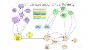
To think through possible impacts, it is vital to take a holistic view of the subject and consider how a broad range of inter-related topics affect each other. The diagram below is such an Influence Diagram. It shows a summary of interrelationships between different aspects of Fuel Poverty, gathered by reading a number of research papers on the topic and using the ‘Circle of Customer Need’ tool to look for any missing topics.
In the diagram, each arrow shows where one topic impacts another in terms of cause and effect. Arrows going both ways between two topics show a feed-back loop. Each topic is represented by a notional quantity, which will increase or decrease according to impacts within itself or from elsewhere. The title given to the topic focuses on describing this notional quantity e.g level of physical health. All arrows have a start and end topic and a +ve or -ve sign at their start. If an arrow has a +ve sign at its start, it means the end topic increases or decreases in line with the start topic. If on the other hand the arrow has a -ve sign the end topic increases when the start topic decreases and vice versa.
influence diagram of fuel poverty in older people
This diagram shows, reductions in physical health causing reductions in mobility, which can cause reductions in the quality of life, which can in turn cause reductions in physical health. This is often referred to as ‘a vicious cycle’. Alternatively improvements in physical health can improve mobility which can in turn improve quality of life which improve physical health – ‘a virtuous cycle’.
Such an influence diagram enables someone to explore the wider implications on fuel poverty in older people, of an action that they are planning to take, and in this way they can plan to handle any unwanted side effects. It can also show opportunities to magnify desirable impacts , or compare the effects of a number of options. The diagram can be improved with experience of use and further research or delved into in more detail, when useful.

